01 The End
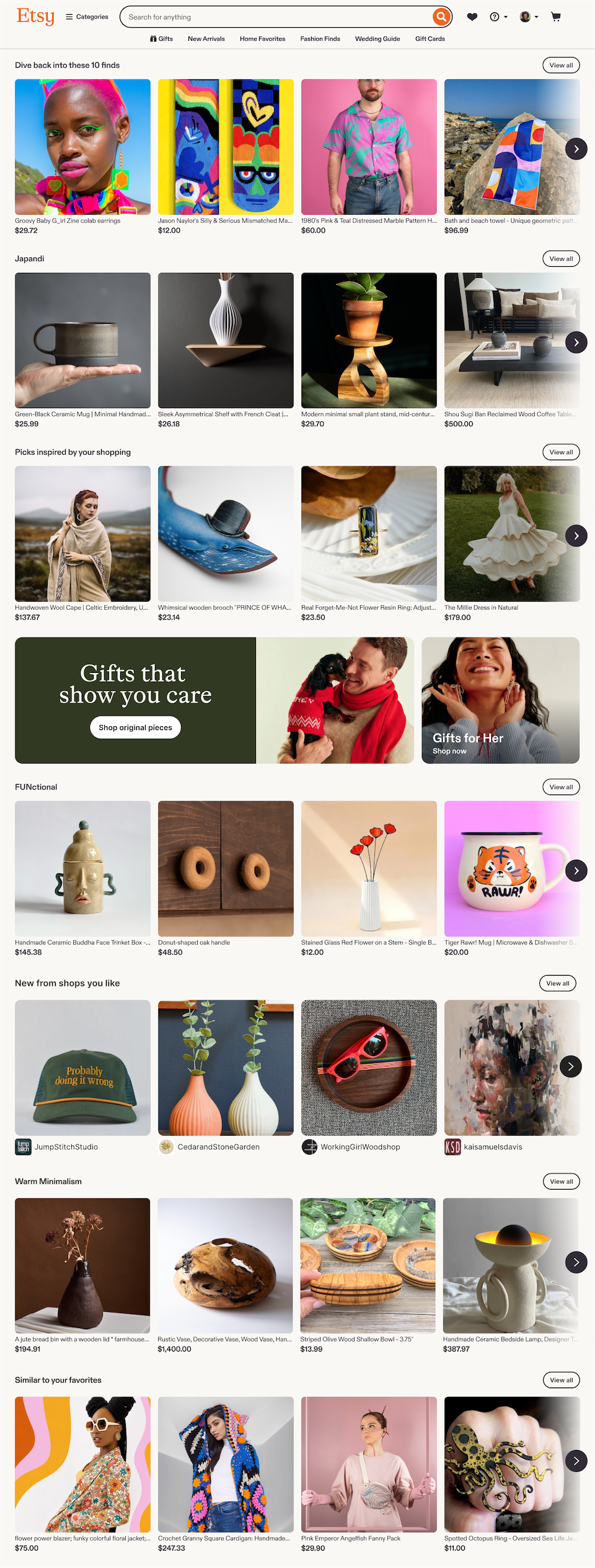
I created a carousel-based design that scaled to support 65,000 themes. All personalized and ranked for each buyer across desktop and mobile.
Impact
Revenue
Conversion rate
CTR
Timeline
02 The Beginning
May 2024. I joined a newly-formed squad focused on Etsy’s homepage.
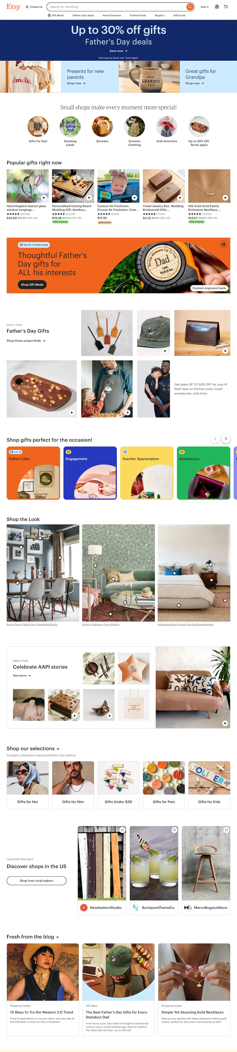
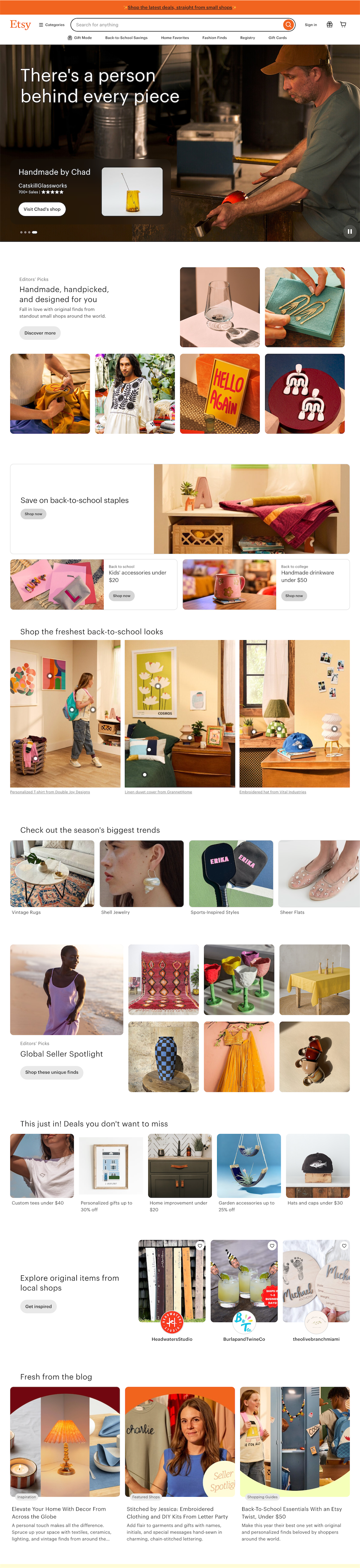
Our first project: a redesign to support a new marketing campaign. We had less than 6 weeks.
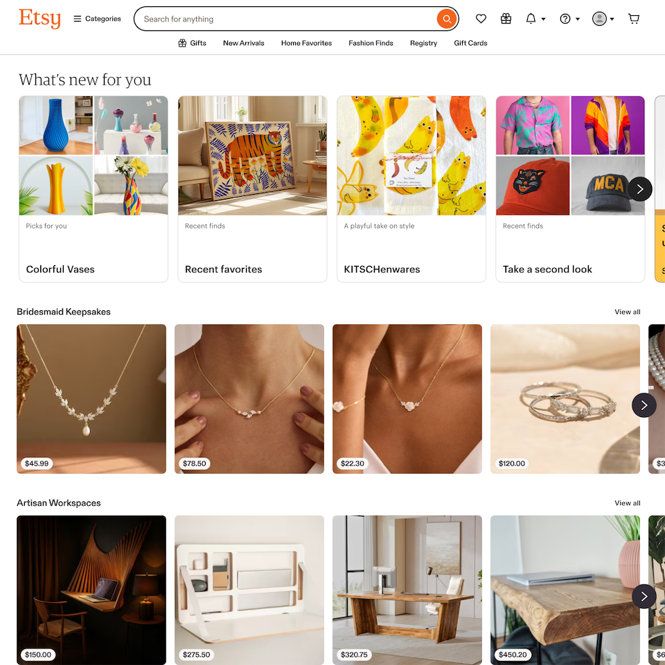
My focus: I designed a new, dynamic header to showcase sellers and brought design polish to every module by refining details like typography, spacing, and styling.
Discovery experiments
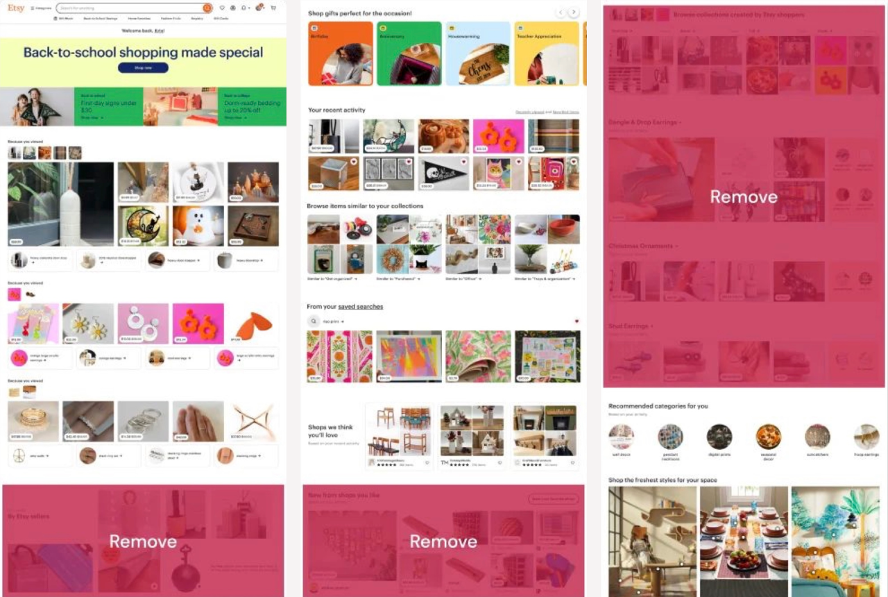
We started by removing distracting, redundant content. This increased engagement by 1.1%.
Next, we added new modules to expose buyers to more shopping ideas.
New content was dynamic, diverse, and fresh, but it wasn’t personalized, and engagement impact was flat.
03 The Spark
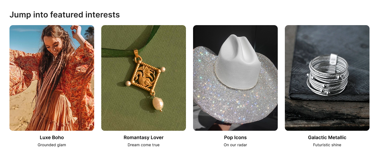
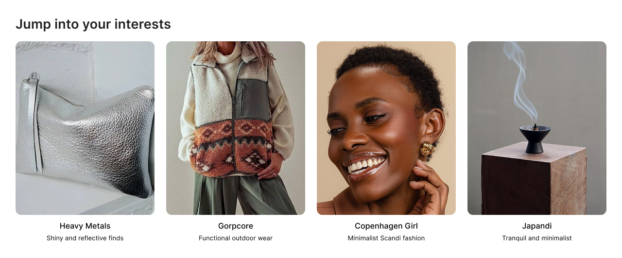
The first spark of promise for discovery content was personalized themes.
Themes are groups of items that are related in some way beyond taxonomy. They’re curated for quality, so they highlight the best of Etsy’s inventory.
The combination of personalization, engaging content, and UX drove a 1% lift to overall homepage clicks.
My solution
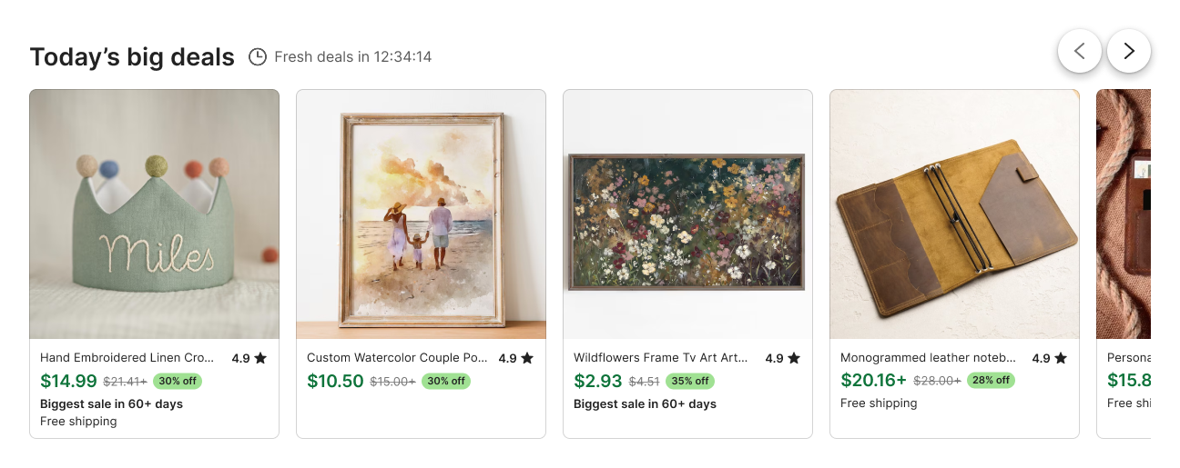
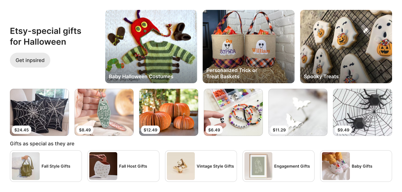
I designed a carousel-based experience. This enabled us to seamlessly blend personalized themes with content like recent activity, deals, and more.
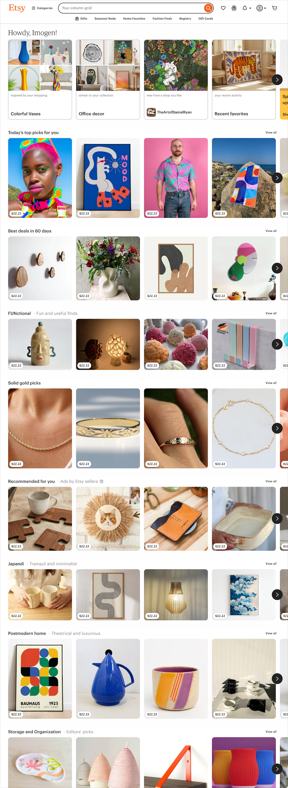
The first experiment
The first experiment exceeded our expectations:
We blended six personalized themes with unpersonalized content—themes had a 2.5× higher clickthrough rate.
Overall, the new experience drove $9.4M in revenue, giving us a strong foundation to build on.
04 The End, Again
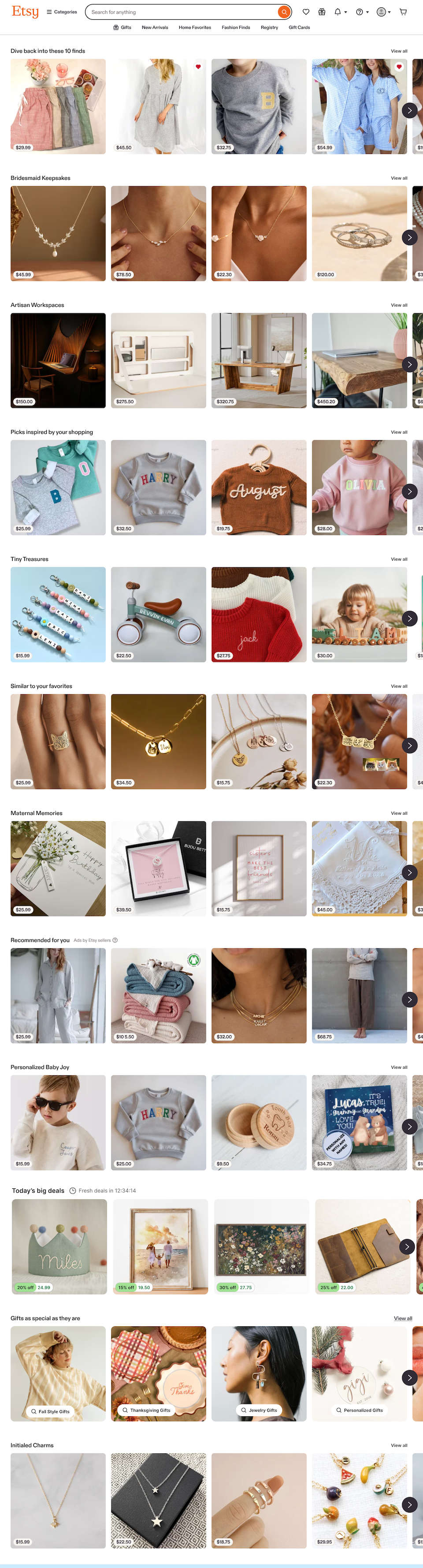
As we learned how people used the new experience at scale, we improved the design, content, and data, driving more than $4M in additional revenue.
Design improvements included a mobile-optimized experience, support for a wider range of breakpoints, and showing more details for each listing.
Overall impact
Revenue
Conversion rate
CTR
Timeline
Theme Landing Pages
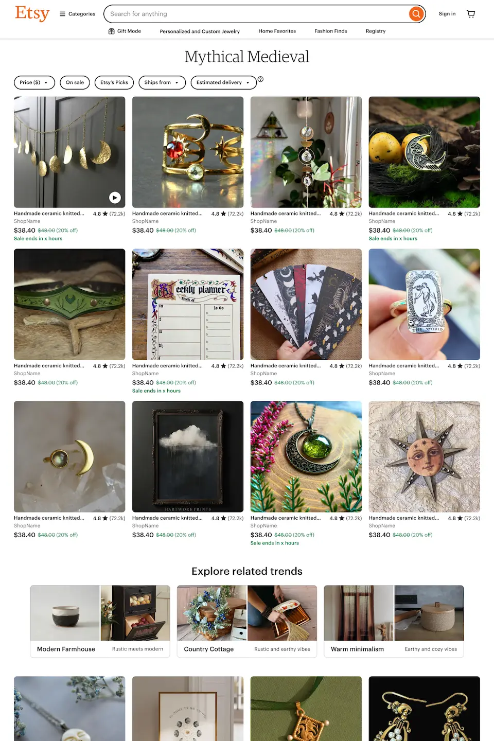
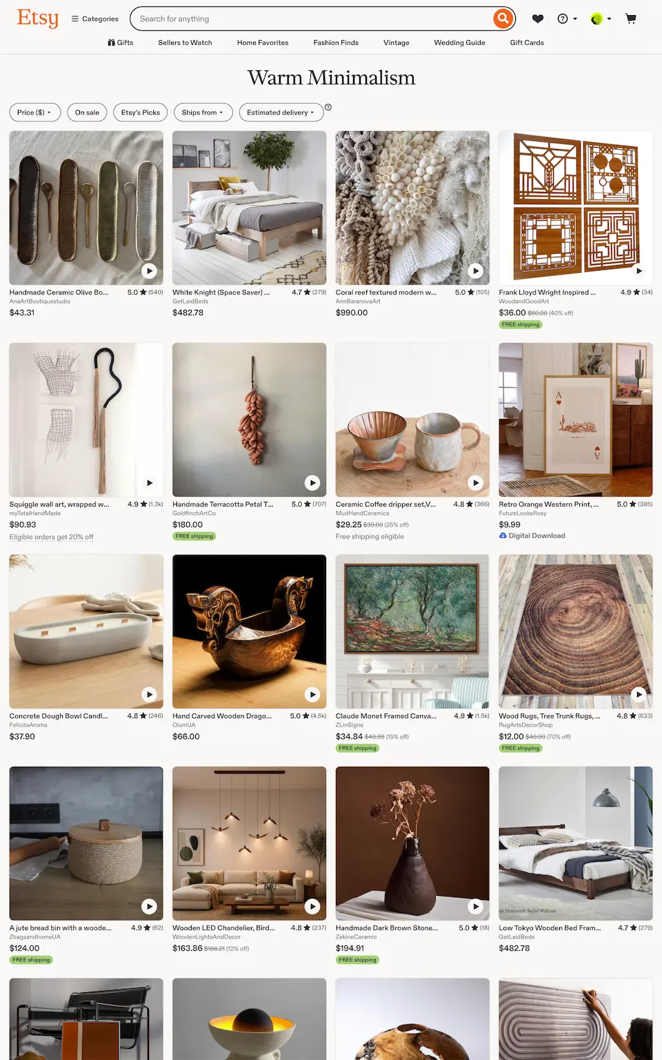
As we developed personalized themes, we realized landings were a weak spot in the experience—there were no pages on Etsy that supported browsing themes.
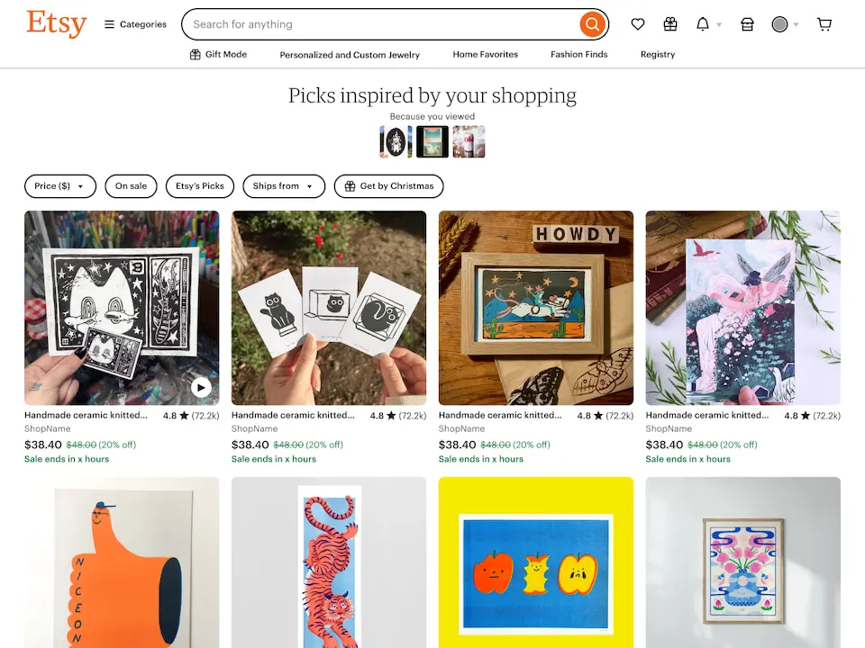
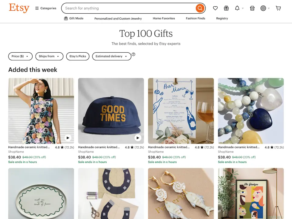
I defined the strategy for the landing pages and designed a flexible system that expanded beyond themes to support active shopping missions, similar items, and campaign landings for email and merchandising.
Our first experiment showed strong engagement, with a 42% CTR, so we launched the page to all users.